Designers are tasked with creating impactful visual experiences, again and again. Good ideas must be executed in a uniquely memorable way to truly leave a mark. Getting there, though, is a journey. And it requires constantly making things better.
As an illustrator and designer, I’m faced with the perpetual challenge of bringing something new and engaging into the world. Clients approach us with problems that require visually creative solutions: start-ups need a branded visual voice; established companies need new websites that align more with their current needs and goals; organizations launch campaigns that must excite the viewer at every point of interaction—the list goes on!
Creativity needs structure
At Jackrabbit, we define project parameters with our clients in a creative brief. Everything outlined in this document guides our thinking. Project parameters (deadlines, audiences, desired results) thus serve as a loose roadmap at the dawn of my creative journey. They define where I’ll start my thinking. With this guide, I immediately move into the research and ideation phase.
Sketching accompanies this ideation phase. I’ve written previously on the Power of the Sketch here, so I’d like to focus now specifically on the process of enhancing a visual concept for the better.
Exploration is key
Defining what is “better” depends on what you are trying to communicate. What is the ultimate goal of your graphic or visuals? How can it better communicate to its intended audience? With the creative brief as a guide, this is where exploration comes in. To make something better, you have to first make it different. And there are an infinite number of ways to make something different!
Given the possibilities, I’ve started curating a list of properties and concepts that I can check my design against and possibly alter to make the concept better. This is a great way to quickly remind myself of possibilities that I may not think of or fully explore initially.
Let’s make it better
This post is the first in a series of posts that will take a look at my “Make It Better” checklist. We’ll start with three concepts from the list:
- Size
- Color
- Shape
These core properties are powerful and form the basis of any design.
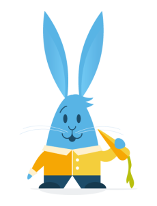 Let’s take the concept of a rabbit eating a carrot for example. For the purpose of demonstrating my list, I’ve created a base graphic to work with. Already, I’ve made size, color, and shape decisions to establish my style.
Now, how can I make this image better?
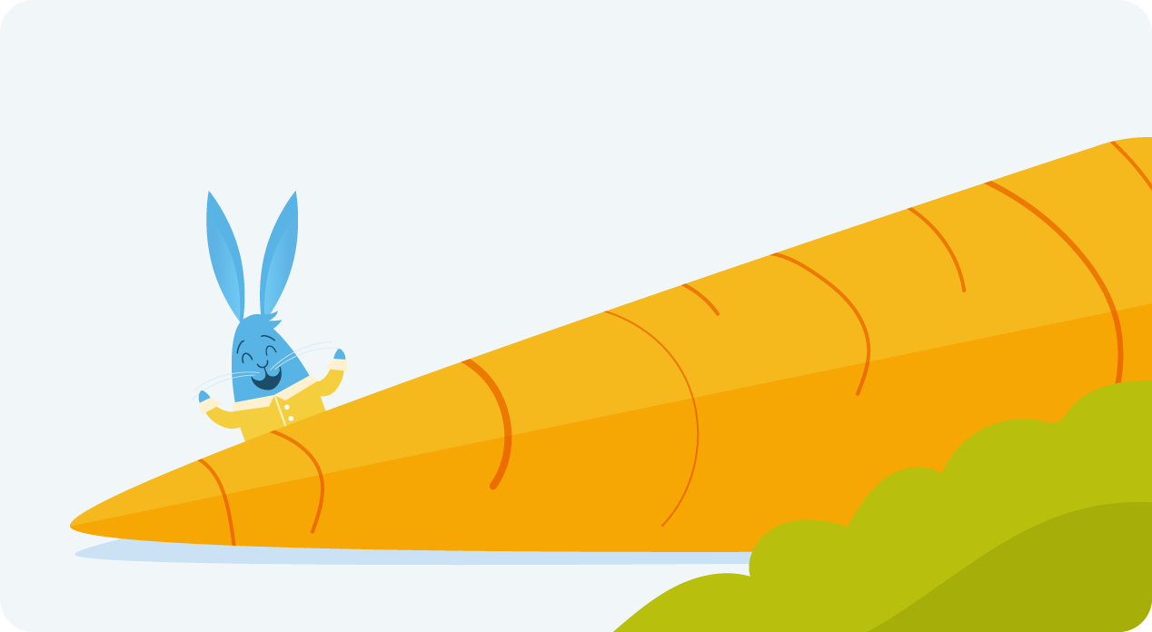
Size
Well, if “better” was to imply “more interesting,” changing size and scale can really create some visual drama—and tell a whole different story. Every property is relative, so when changing the size of one element, this is always in contrast to another element. The carrot now feels huge in contrast to the rabbit, making his easy snack into an endless feast.
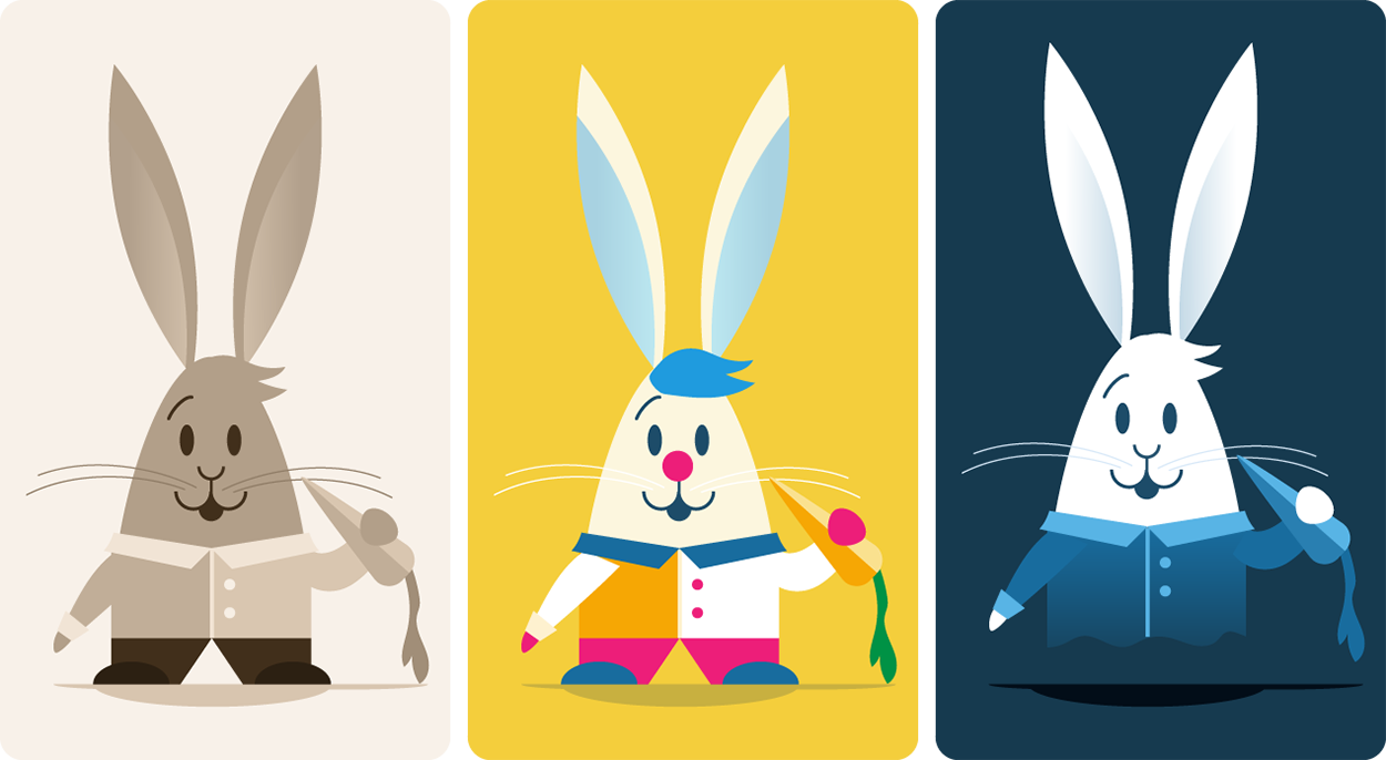
Color
Color alone has a powerful ability to tell a story. As one of the strongest assets in the designer’s toolbox, it can serve as a base to establish the type of mood and energy conveyed by the visual. Starting with our base graphic, changing to a sepia tone instantly alludes to photography from another era.
A mix of vibrant and saturated colors can be very playful, giving us a more whimsical image.
As our natural perception of color is dependent on light, color is especially helpful when defining the time of day and location. With our third rabbit here, the all-blue color scheme reminded me of a room with very little light at night. Perhaps the rabbit is getting a midnight snack? Or is it a ghost in the dark?!

Shape
When I read “shape” on my “Make It Better” checklist, I’m reminded to assess and reassess the shapes I’m working with. Can those shapes work to better communicate my message? A simple change to his shirt and pants suddenly makes him look a little healthier and more fit. A more drastic change, such as simplifying the geometry, can offer a completely different energy.
A creative brief would help me assess if I am heading in the right direction with these changes. Since my goal now is simply to highlight the power of all of the properties and concepts on my list, I’ll just experiment and let the images speak for themselves.
The “Make It Better” checklist
This ever-evolving list has been a great resource in quickly prompting me to consider design alternatives. Here is the full list in its current form, and in no particular order:
- Size
- Color
- Shape
- Pattern
- Texture
- 2d? 3d? 4d?
- Lighting
- Medium?
- Mix mediums?
- Style
- Variety
- Similarity
- New element
- Proportions?
- Abstract? More literal?
- Inverted?
- Simpler?
- Geometry/symmetry?
- Organic/fluid
- Motion
- Foreground/background
- Layers
- Transcendant / grander
- Visceral reaction
- Sound
- Taste
- Smell
- Time – past/future
- Anticipation / relief
- Energy
- Excitement
- Connections / relationships
- Expected vs unexpected
- Yes, and…
- Next level
- Coincidences
- Universality
- What universe?
- Audience, personalities
- Different vs familiar
- Amount of
- Nature
- Look-alikes
- Mask/crop/ knock out
- Isolate it, place it
- Allude to it (just enough)
- Split it apart
- Off the page
- Combine, merge
- Depth, angles (not straight-on view)
- Mix it up
Let us know if you enjoyed this peek into the creative process. For you creators out there, does this sort of consolidated list help? Do you have any other great tips to share?
Stay tuned for the next post as we continue to explore these concepts. Where our rabbit goes is anyone’s guess. We’re aiming for better!