A few short years ago, we as designers were only limited to a small handful of web-safe fonts to use in our designs.
If we wanted to use a custom font, it needed to be an image or rendered via Javascript. Now, things have changed. We can essentially use any font we wish with the technology known as @font-face (with the appropriate license, of course).
A @font-face font can be generated by some online services with hundreds (thousands?) of free @font-face fonts downloadable from fonts.google.com and fontsquirrel.com, in addition to fonts available for purchase. The code generated by these sites allows you to easily copy and paste the CSS code directly into your CSS file. But that’s not the ideal thing to do, in terms of design.
Here’s where it gets technical
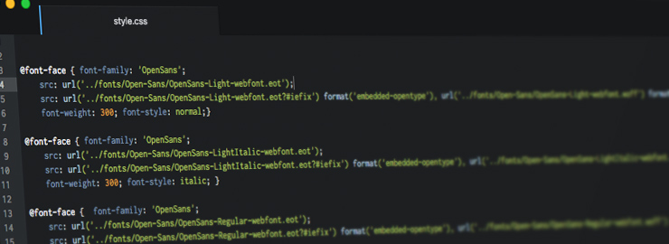
When @font-face CSS is generated and downloaded, it outputs a certain snippet of code. Using Open Sans as an example, it can look like this:
@font-face { font-family: ‘open_sansregular’;
src: …;
font-weight: normal; font-style: normal;
}
@font-face { font-family: ‘open_sansitalic’;
src: …;
font-weight: normal; font-style: normal;
}
@font-face { font-family: ‘open_sansbold’;
src: …;
font-weight: normal; font-style: normal;
}
@font-face { font-family: ‘open_sansbold_italic’;
src: …;
font-weight: normal; font-style: normal;
}
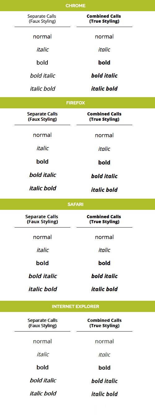
These services define each font file and name them individually. This isn’t entirely a bad thing until you need to make the text bold or italic. It will fall back to the browser’s rendering of that font file, not the bold or italic version of that font. In other words, styling open_sansregular bold will bold open_sansregular, but it won’t force the browser to use open_sansbold. This results in faux styling, and this faux styling is different from browser to browser.
Enter a web font mentality for @font-face
When a developer styles Arial bold, they expect the browser to use Arial’s bolded font, not Arial’s regular font, bolded – correct? That’s because the hinting for each style and weight is contained within the Arial font. So we have to define the same with a @font-face. Taking the example code from above, we can change things up a bit:
@font-face { font-family: ‘OpenSans’;
src: …;
font-weight: 400; font-style: normal;
}
@font-face { font-family: ‘OpenSans’;
src: …;
font-weight: 400; font-style: italic;
}
@font-face { font-family: ‘OpenSans’;
src: …;
font-weight: 600; font-style: normal;
}
@font-face { font-family: ‘OpenSans’;
src: …;
font-weight: 600; font-style: italic;
}
Now, with this code, by styling Open Sans as bold (or in this case, 600) the browser will now use the actual bolded version of Open Sans and not a browser-rendered faux styling.
In the code above, notice the changes to font-family, font-weight, and font-style. There are a couple of things going on here:
- Numerical Weights – For @font-faces containing more than 2 weights, it’s ideal to assign 400 to a normal or regular weight, and increase to 900 or decrease to 100 for bolder or lighter versions of the font, respectively. For those @font-faces with only 2 weights, normal and bold will suffice.
- Lightest to Boldest – When declaring the @font-face this way, it’s best to start with the lightest version of the font and increase the weight to the darkest version of the font, alternating between normal and italic as you do so. (ie. Light, Light Italic, Normal, Normal Italic, Bold, Bold Italic, Heavy, Heavy Italic). Doing otherwise can yield awkward results in IE8.
When starting a new dev project with a freshly-generated @font-face font, spending 5-10 minutes cleaning up and organizing the @font-face calls will greatly ease development and avoid awkward troubleshooting with <strong> and <em> tags. These tools should help you retain consistency and achieve the desired effect for your web copy.