When coding emails in 2022, it’s easy to get caught in a rut, especially if you’re dealing with requests for less-than-modern methods for creating and sending emails. A well-developed HTML email helps your clients appear polished, professional, and dare we say, “with it”.
Read on to learn some of our favorite tips and tricks we employ with our clients, and we hope you use them when working on your projects!
Do use Google Fonts
Let us explain…Outlook doesn’t render Google Fonts (since you’ll need to call them in the <head> and Outlook strips the <style> tag), but that doesn’t mean you should only use Arial and Times in every email.
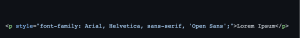
You can use Google Fonts in your email designs. As long as their line height, letter spacing, and font-size rendering will be friendly when Outlook defaults to Arial and Times. Always use font stacks and make sure your Google font calls don’t have double quotes, as Outlook becomes finicky and can ignore the whole font-family rule if one of them has double quotes.
When calling your Google Fonts in the <head>, the most foolproof method is to use an @import call in the <style> tag.
Unfortunately, Outlook ignores this style tag, so inline styling should be used for your most important, structure-based CSS rules.
A forum posting from Litmus explains a really neat trick to make sure Outlook falls back on Arial rather than the default Times New Roman, and here’s a snippet for your convenience:
![<style> [style*="Open Sans"] { font-family: 'Open Sans', Helvetica, Arial, sans-serif !important } </style>](https://www.jumpingjackrabbit.com/wp-content/uploads/2021/09/Screen-Shot-2022-09-19-at-9.00.20-AM-300x92.png)
Then, inline, make sure your font-family stack is as follows:
*Note that if your client is perfectly fine using Arial or Times New Roman, there’s no need to force a Google font in this case.
Don’t be afraid to nest your tables. Seriously.
Nested tables make the task of vertically spacing your elements trivial, and will cause fewer bugs in Outlook’s rendering system. Add your background color to your <table>, and your padding-top and padding-bottom to your <td>:
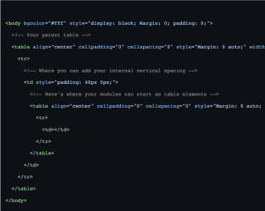
Note: Make sure that the <td> that has your vertical padding is the only <td> in its parent tr, otherwise you may run into spacing inconsistencies in Outlook.
When working with horizontal spacing, the most fool-proof method doesn’t involve margin or padding as it does in normal 21st-century CSS. You should be using empty <td> with a width attribute to control horizontal spacing. Below, I’ll start the snippet with our child table from above and continue with some left and right “margins”:
At this point in your code, your vertical spacing should already be taken care of. In the <td> that holds your content, make sure that its width is taking up the exact space that the <td> elements aren’t. Now you’re free to now add your image and text elements as usual!
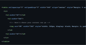
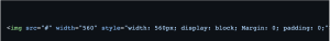
Do pay attention to your width on images
Notice how I added a width attribute to the <img>? Outlook will otherwise expand the image to its 100% width, even if your <td> has a fixed width. Also, add display: block; Margin: 0; padding: 0; to each <img> to make sure it doesn’t have excess spacing that the browser or rendering system adds by default.
What about retina images?
You can export your images as 2x from your design software and still use them in your email code. As long as your width attribute is accurate, your image won’t expand beyond the boundary you’ve set in your <td>. If you don’t specify the width attribute, your image can increase the width of your <td> and completely mess up your overall design.
Don’t ignore the email service
Coding emails can give you tunnel vision—and some email service providers have different methods or best practices that can affect your code. Not to mention the astronomical list of unsupported CSS rules that makes coding emails feel like we should be worried about Y2K again.
Jackrabbit utilizes Email on Acid. This tool is an industry-standard and is packed with features to help make sure your email code renders well in every email platform. In 2022, Email on Acid dropped its support for Outlook 2007 and 2010. These two email platforms were the cause of many headaches in the HTML email development world. With less of the world using antiquated software, we can better implement features like responsive design, ADA compliance, and custom fonts.
What do the Jackrabbit Nerds recommend?
There are multiple email services we love to use when working with our clients. Salesforce’s Pardot has a robust content management system for single emails and templates. Hubspot (a Boston-area company!) has some developer-friendly features that make the coding process a breeze. But the Rabbits’ favorite email service is Mailchimp—with its robust template capabilities, it’s really a no-brainer. All of these platforms have campaign flows, actions, and triggers for email marketing initiatives.
SALESFORCE PARDOT
While currently undergoing some transitions into Salesforce’s main interface, Pardot is still one of the flagship email marketing platforms that we like using when working with clients. Pardot has the ability to use advanced dynamic content, templatize email designs, and integrate seamlessly with the industry-standard Salesforce platform.
HUBSPOT
We won’t get deep into the CRM capabilities that are shared/differentiated between Salesforce and Hubspot, but Hubspot is a much easier and user-friendly tool to work with that won’t require immense amounts of training and practice to learn the ins and outs. Hubspot has custom syntax and attributes which gives breadth to template development. Plus, their help desk and developer documentation are second to none.
MAILCHIMP
Mailchimp has custom attributes that make coding emails a bit more time-consuming but ultimately create an amazing template experience for the client. Many comparison articles online fail to mention this feature, unfortunately. While Mailchimp does not boast a customer relationship management (CRM) tool as Salesforce’s Pardot, Mailchimp can cater to both B2B and B2C organizations and still scales well with a growing customer base, and has a much smaller monthly cost!
WHAT ABOUT CONSTANT CONTACT?
While Constant Contact has been a mainstay in the email marketing space for many years, it hasn’t grown in complexity in the ways of other platforms. It’s a great visual email builder for marketers who aren’t HTML savvy, but without the ability to even change the plain text in a visual editor, many clients need additional help with their campaigns more often than when they use a platform like Mailchimp or Pardot.
WHAT ABOUT [INSERT EMAIL PLATFORM HERE]?
While there are countless email marketing tools at your disposal, Jackrabbit recommends the above solutions as they are tried and tested by our developers, and provide the tools and resources needed to not only set us up for success but ultimately leave our clients with templates that they can use and repurpose going forward.
Don’t code everything from scratch, every time
Campaign Monitor has a few very handy tools that can make pesky buttons and background images a breeze.
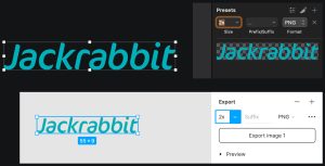
Our team utilizes Sketch, a feature-rich UI design tool when creating new email designs. Having a template to work from can make the design-to-dev handoff very seamless.
| Sketch Artboard specs: | |
| Columns | 12 x (35px) |
| Gutters | 11 x (20px) |
| Total Width | 640px |
Artboard width: 800px (you can make this whatever you want)
Once you establish a baseline for future email designs, you can templatize your parent <table> element, margins, and font stacks to save valuable time in development. But of course, you’ll run into email designs that won’t fall gracefully into your code template.
Responsive Design and Development
Hubspot claims that over 60% of emails are opened on mobile devices. Mobile responsiveness can’t be ignored. While Outlook still doesn’t support the style tag (which is needed for media queries), it’s still worth the extra time and effort to make sure our emails can be consumed easily on smartphones. Email on Acid has a great beginner’s guide to responsive email development.
Do use tools and resources to help development workflow
Here are some helpful links to help save time and energy while you’re coding and listening to lofi hip hop beats to study and relax to:
Code Tools
CSS Inlining
Fonts
Pre-Deployment Checklist
Further Readings
Codepens & Git Repositories
Conclusion
And with that, those are our top tips and tricks for setting yourself up for success in email development and marketing. If you have any questions or want to offer up a tip of your own, comment below or send us an email at [email protected].
Be well, and code smart!
Ben and Hillary
Last updated on August 10, 2022