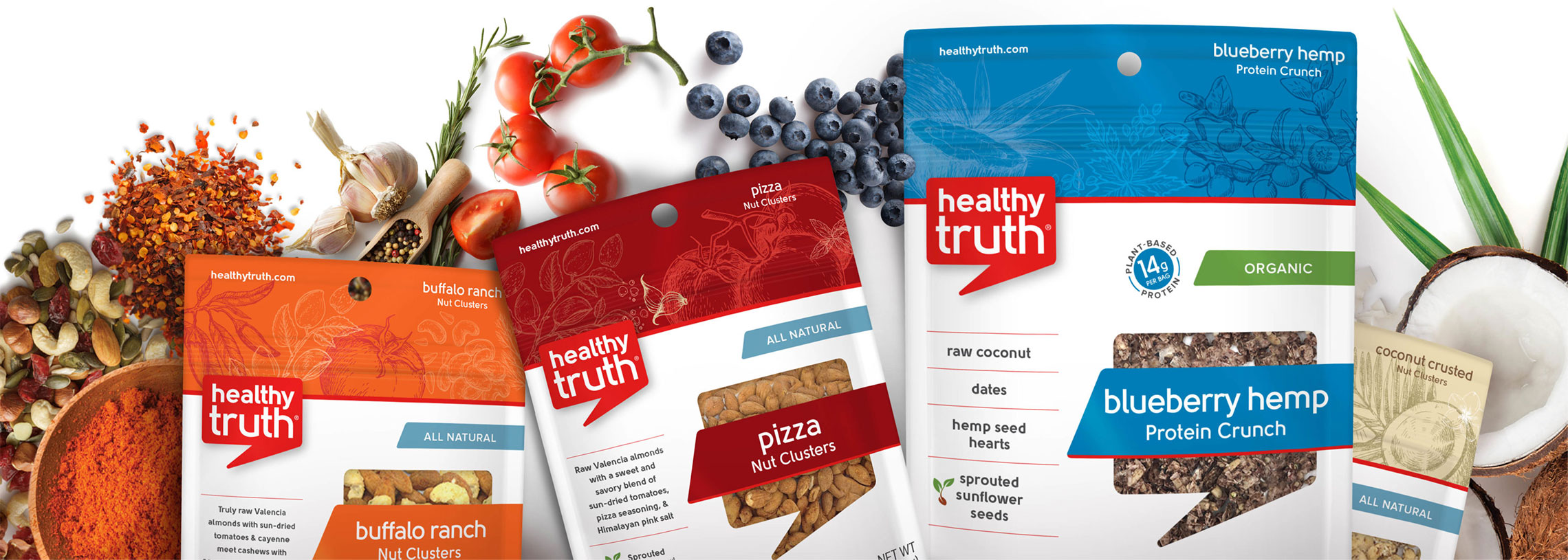
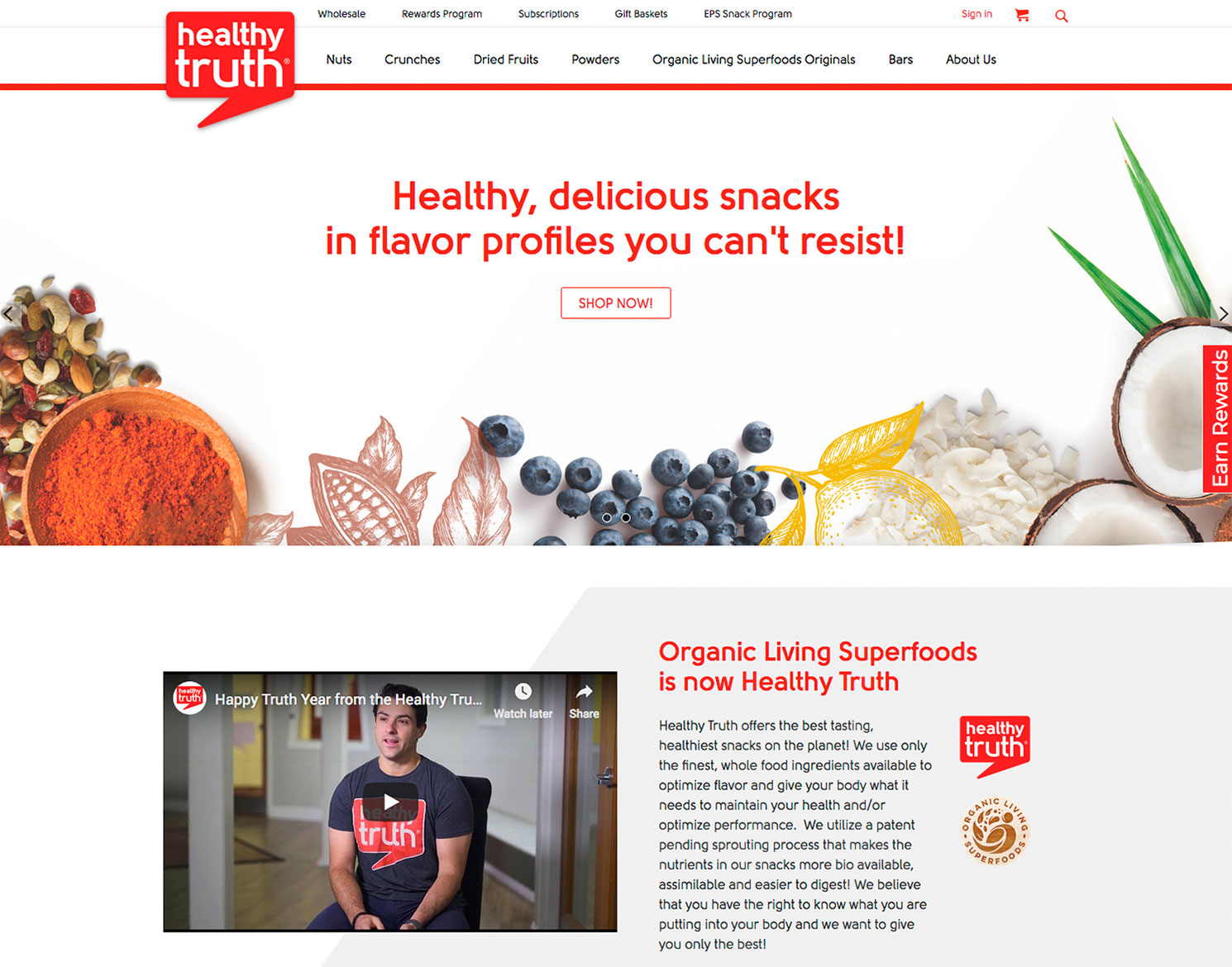
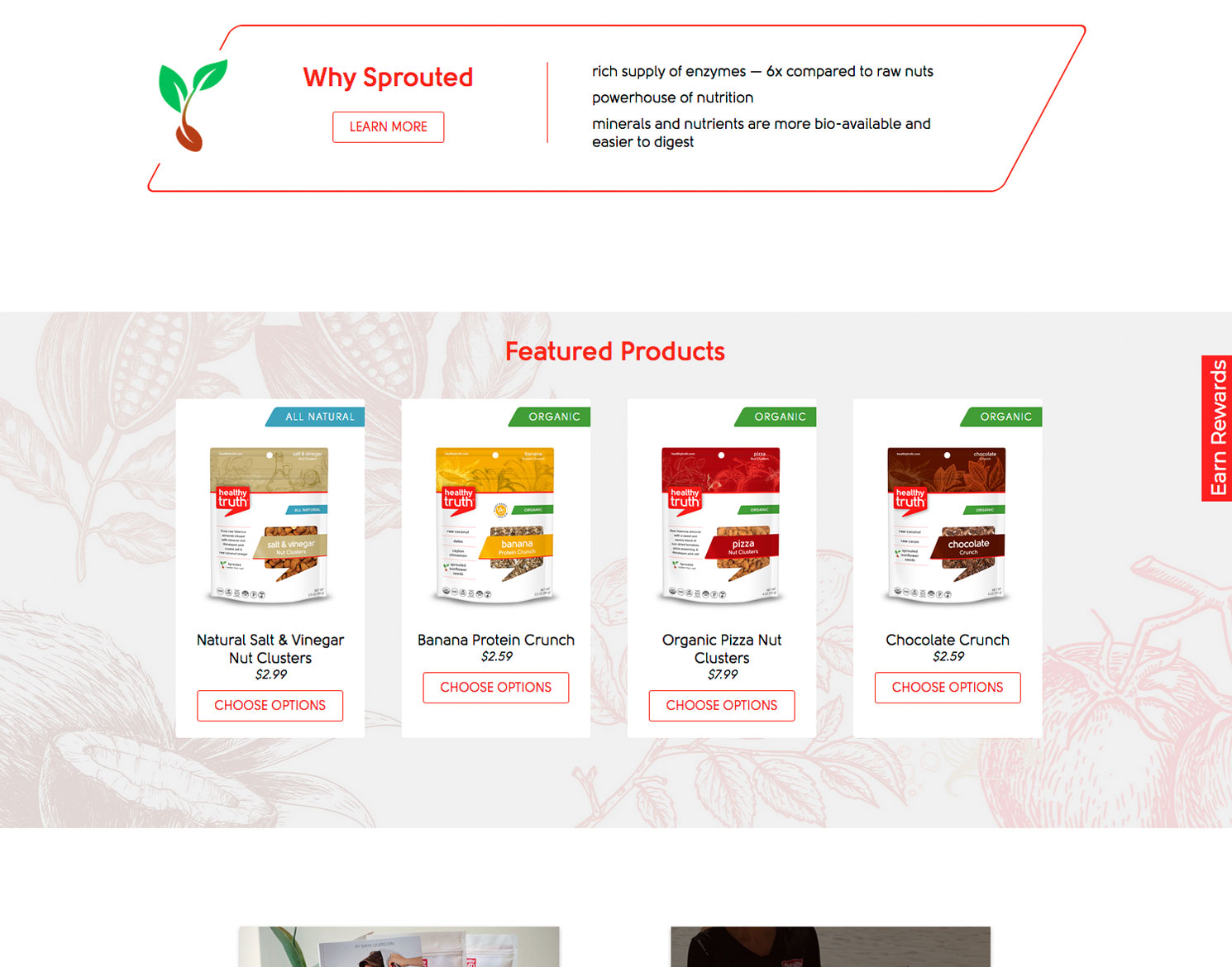
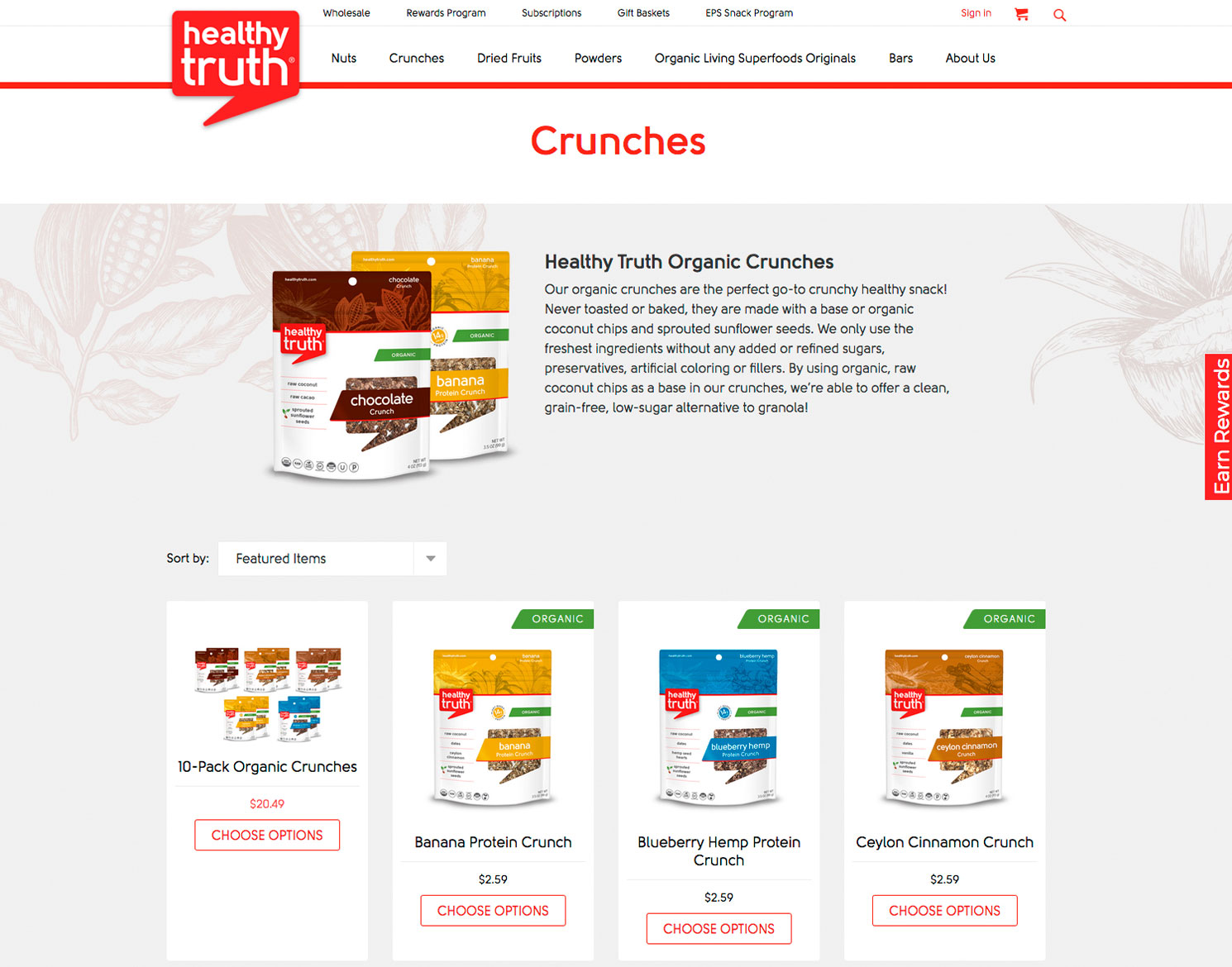
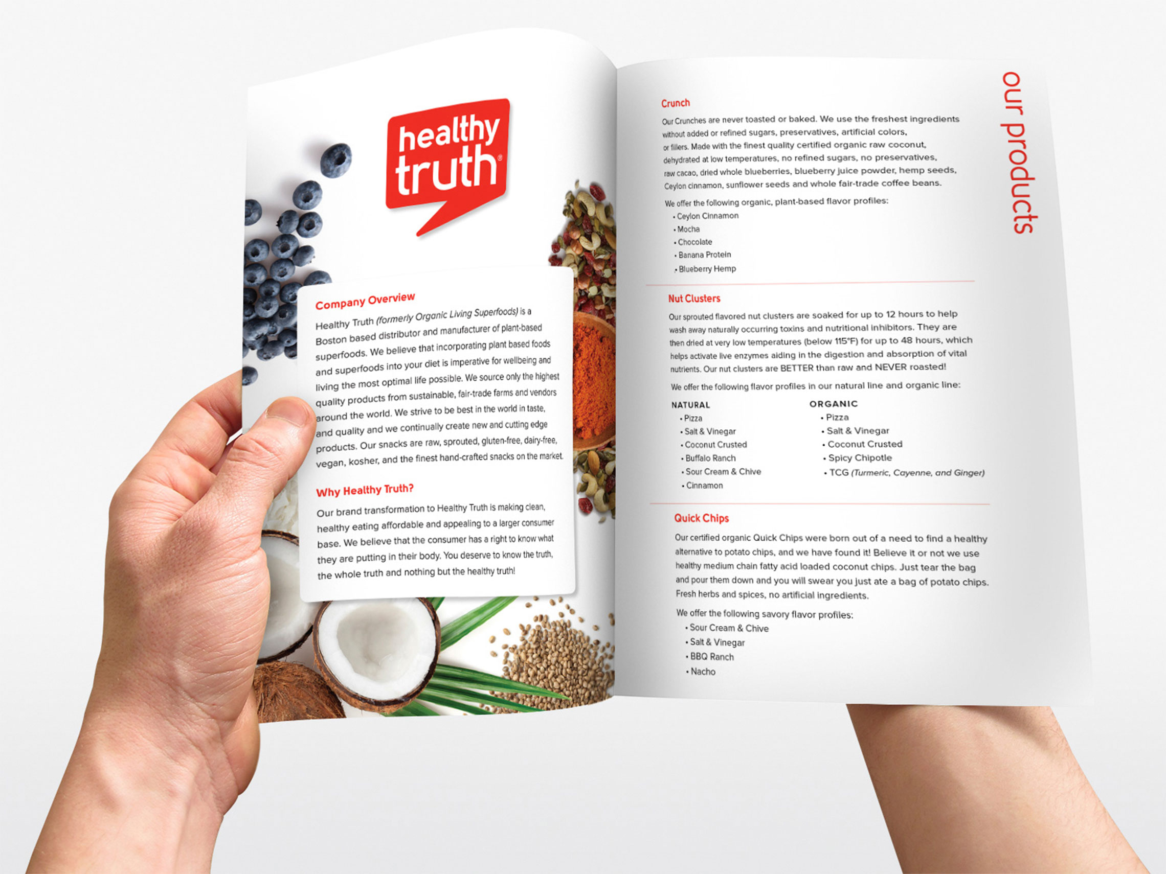
Case Study

Branding & Packaging Design for Healthy Truth

We're nuts for this packaging design.

OVERVIEW

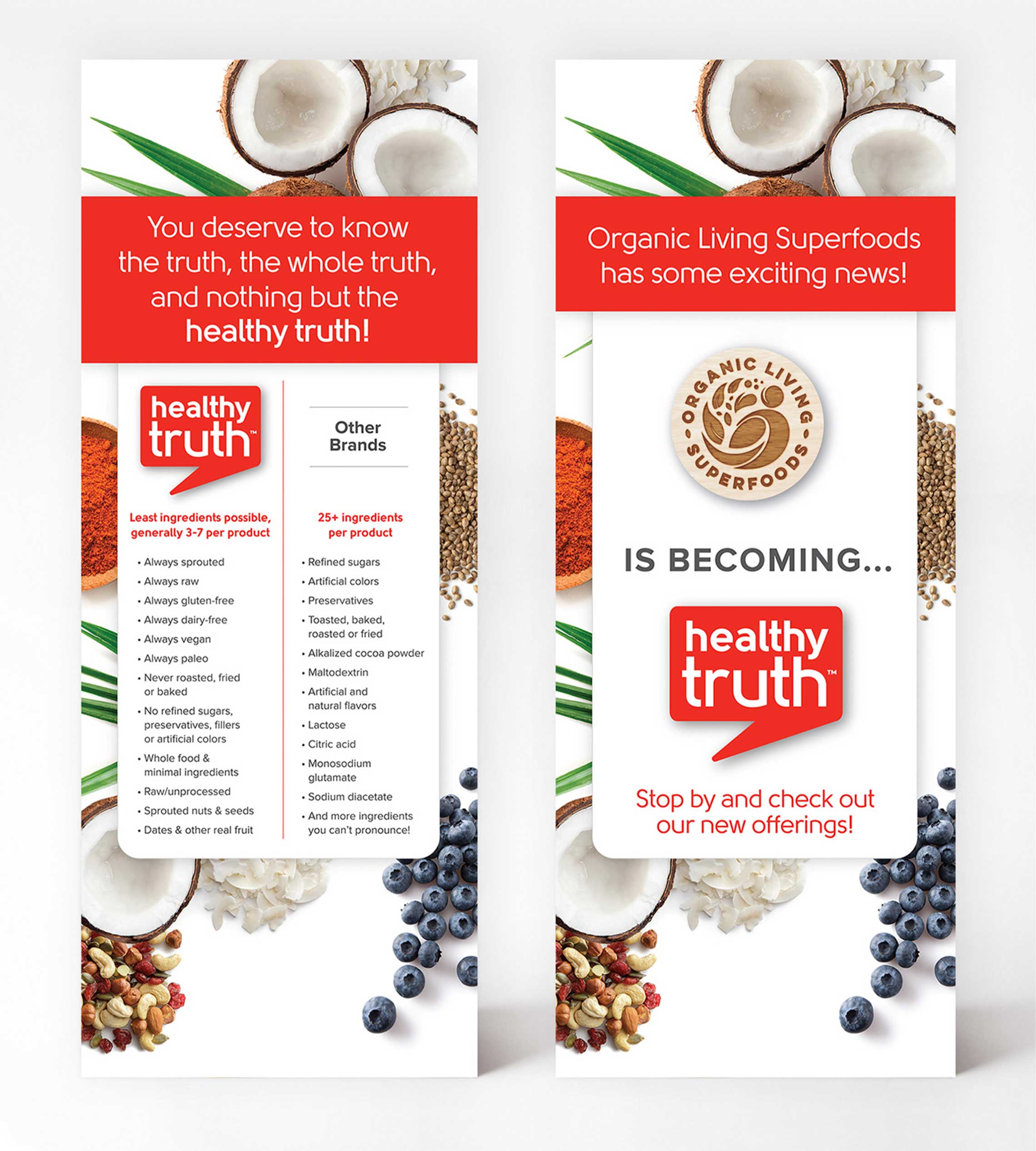
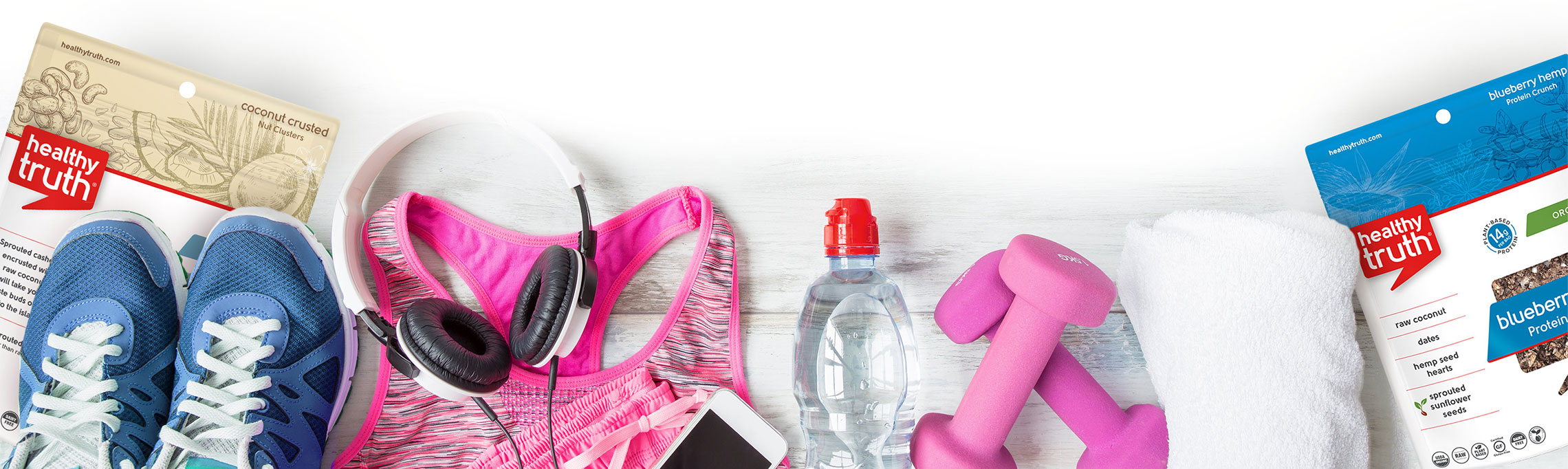
When Healthy Truth approached us to redesign their brand and packaging, we hopped at the chance (and not just to sample the yummy goods!). Formerly Organic Living Superfoods, Healthy Truth turned to us to help them transition to a more approachable brand. The updated look and feel gets across that they’re more than a snacking company–they are a health food company that helps people (of all kinds) enjoy healthy food.

Logo Design

It was important that the new identity communicate that Healthy Truth is set apart from other “healthy” food companies in that they’re totally transparent about the clean ingredients in their products. The brand should look smart, thought-provoking, and educational. We achieved this in the new logo by using a bold red, which is unapologetic and disruptive. The speech bubble element speaks to their openness in having conversations about healthy foods and that they are not afraid to speak the truth.

Healthy Truth Logo design
bags of healthy truth snacks

Clean, Simple, and Honest

The task at hand for this packaging design was to align with the tenets of their brand and the snacks they produce. The Healthy Truth makes flavorful snacks that incorporate superfoods and natural ingredients that are sustainably and fairly sourced; clean labeling is everything to them and the packaging design needed to reflect that.

Web Design & Development

We carried the new brand design and aesthetics established in the packaging to the website. Our focus was on creating main hero banner graphics that clearly communicated key brand messages and celebrated the new visual identity.

healthy truth website home page
healthy truth website product page
healthy truth product detail page
healthy truth website home page
healthy truth website product page
healthy truth product detail page
Previous
Next
four people sitting on the couch eating pizza

#HAPPYTRUTHYEAR

Healthy Truth leveraged the Rabbits full set of video capabilities to create a series of videos to kick off their #happytruthyear campaign. The campaign focused on the reward of making decisions that are true to yourself and your health and wellness goals.

View more on YouTube

Healthy Truth flavor choices showing illustrations by Jackrabbit
'About Healthy Truth' infographic
Healthy truth brochure

CLEAN INGREDIENTS, CLEAN COLLATERAL

From business cards, to tradeshow banners and brochures, the new brand needed to communicate Healthy Truth’s tenets regardless of medium. The Rabbits expanded on the brand visuals by complementing the strong, red logo with bright ingredient photography against crisp white backgrounds.

Healthy truth business cards
person cutting strawberries
Healthy Truth rebranding signs
workut gear and healthy truth products

We have created a wonderful partnership with the Jackrabbit team. They really pushed our team to think outside the box when it came to the rebranding of our company, but took the time to really understand our mission. Our new logo and product packaging turned out amazing and we've received many, many compliments! We look forward to continuing to expand our partnership.

Caitlan Morris Marketing Director (former), Healthy Truth