Case Study

Branding & Packaging Design for Ermont

Crafting a distinct brand design and packaging for South Shore's pioneer medical marijuana dispensary.

OVERVIEW

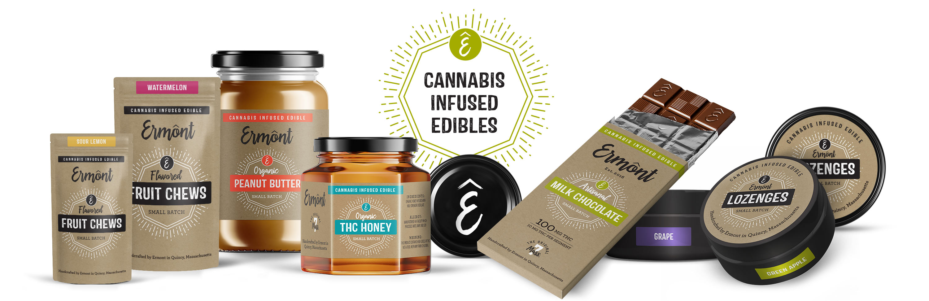
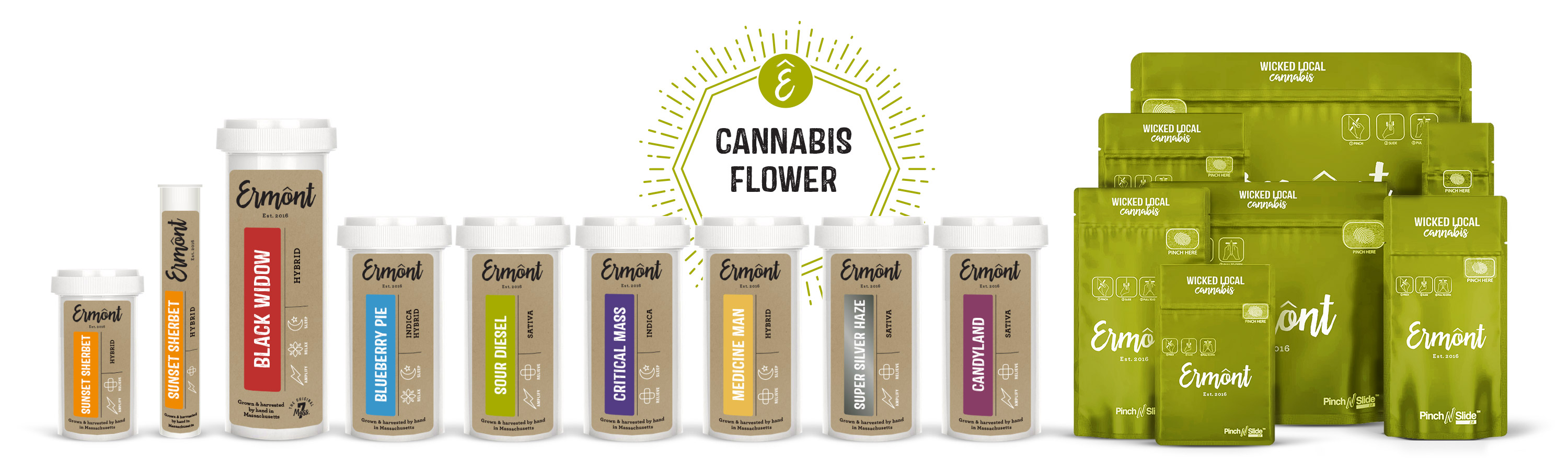
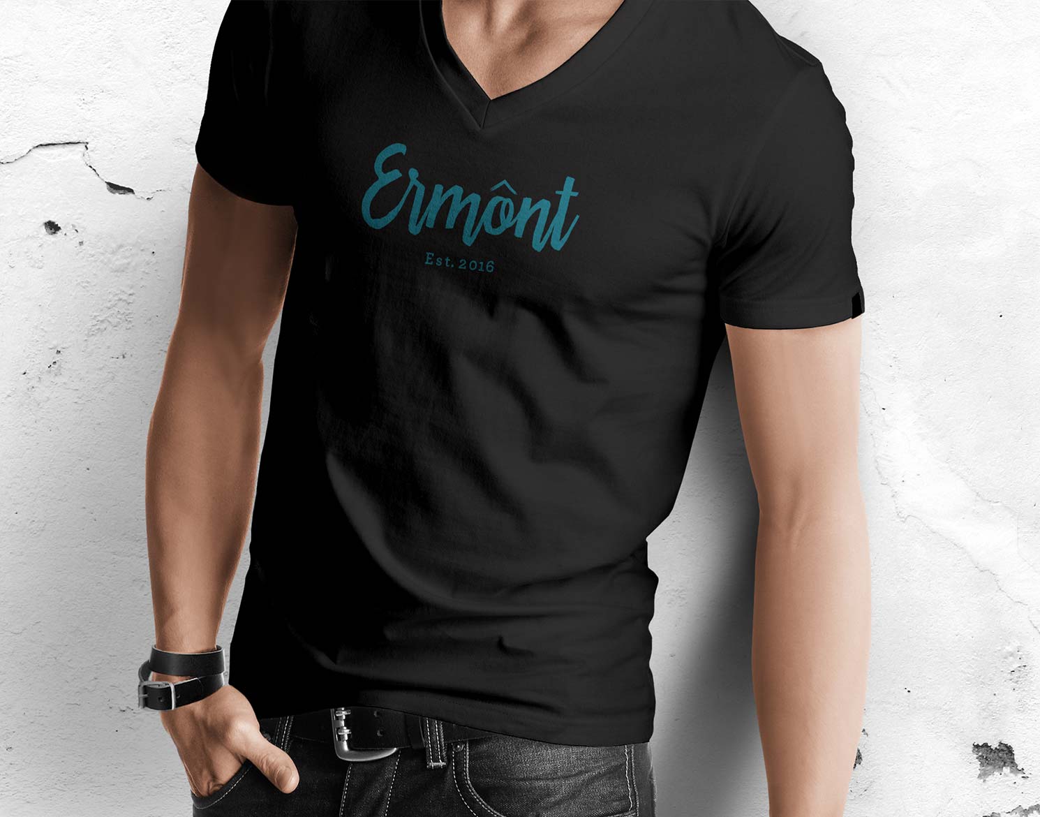
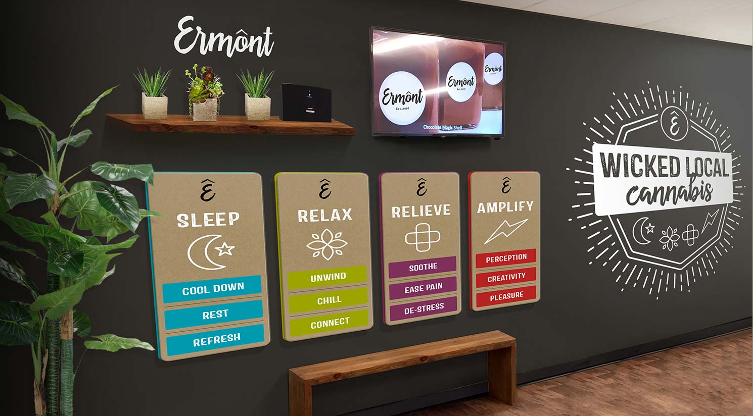
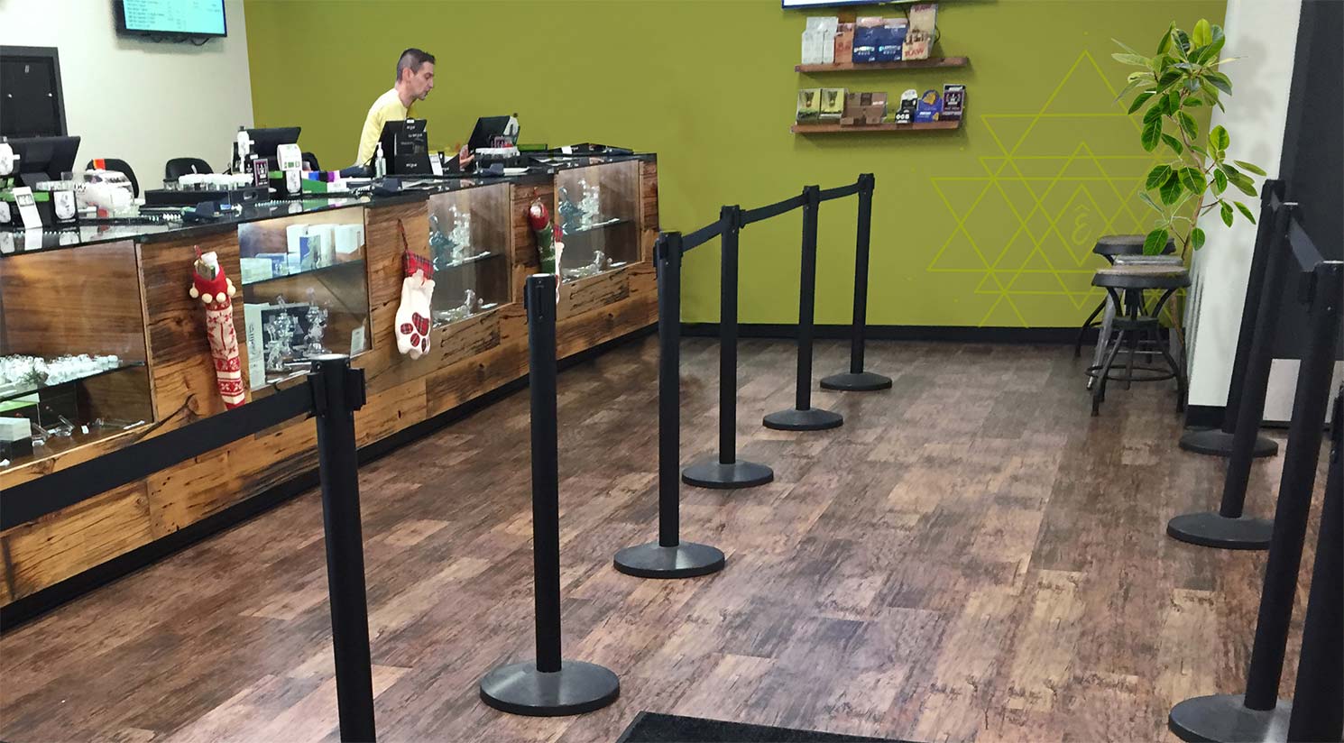
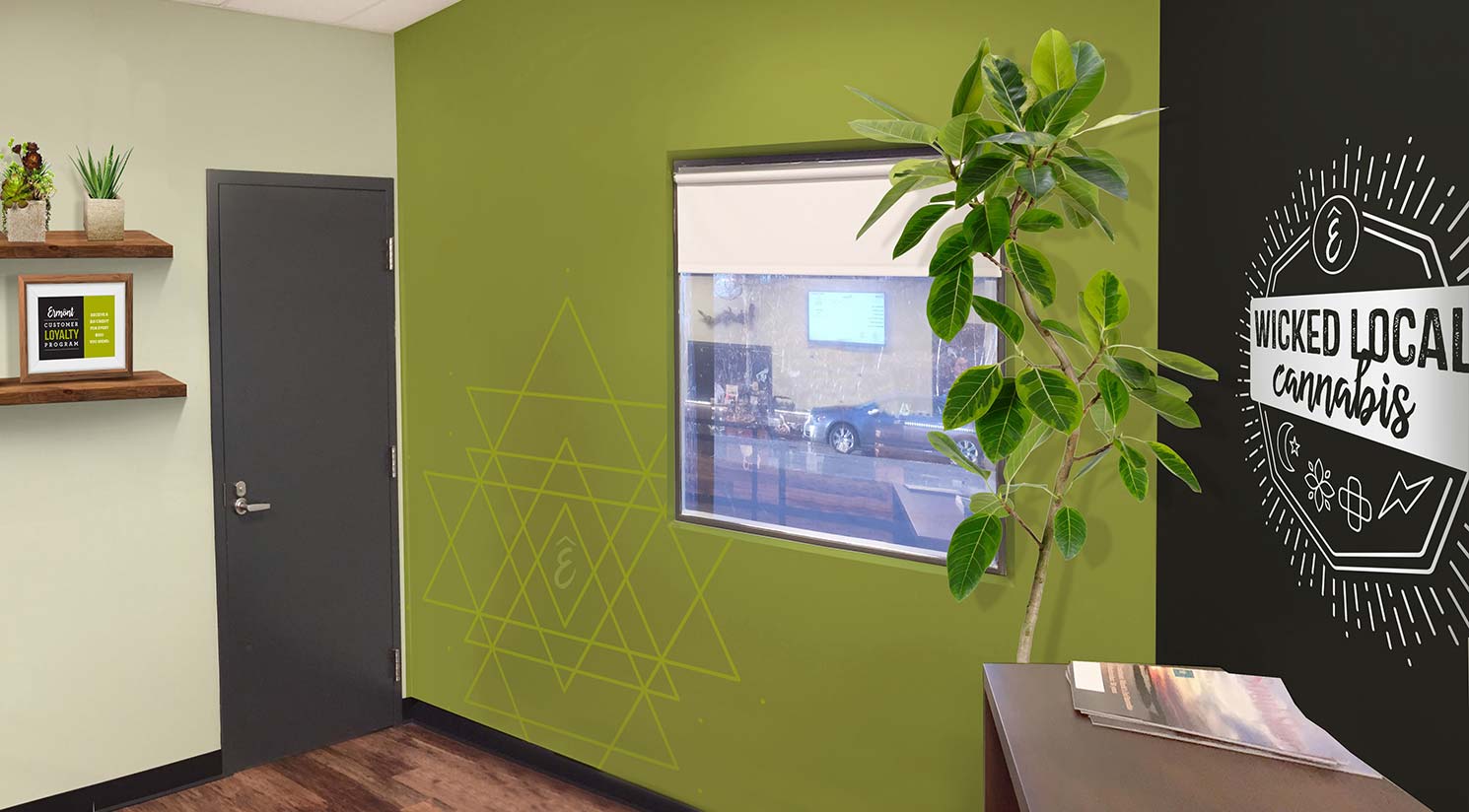
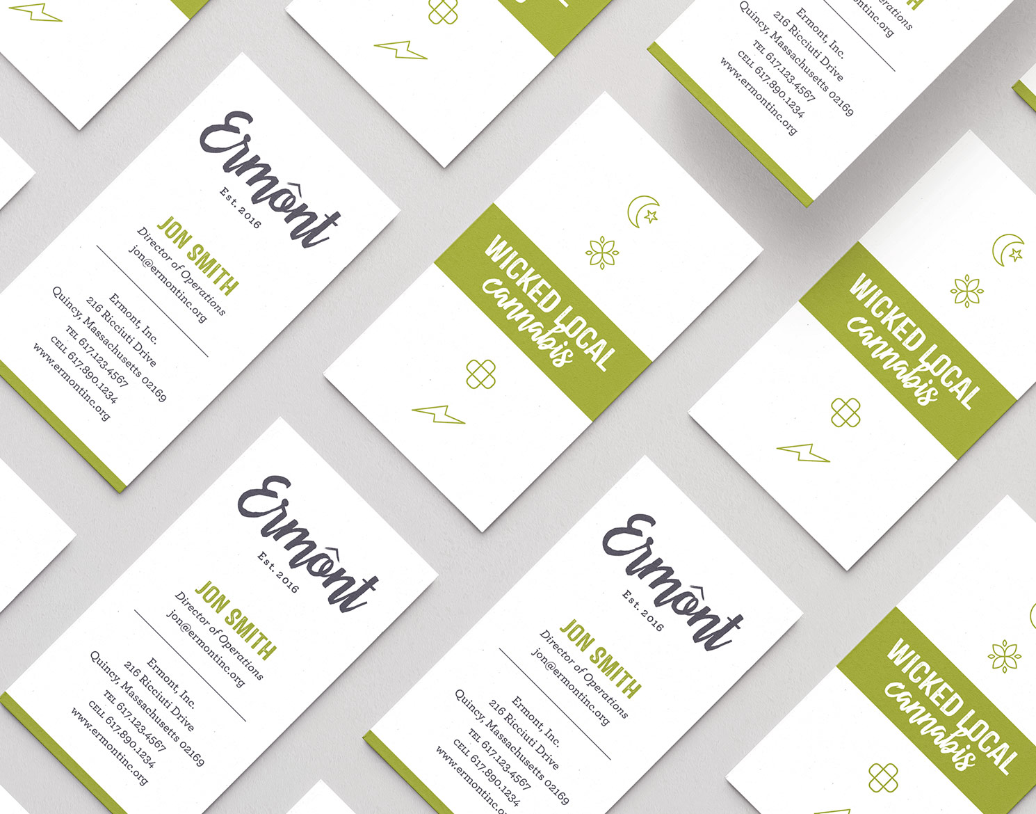
As one of the first 7 medical marijuana dispensaries to open in Massachusetts and the first on the South Shore, Ermont was passionate about the cultivation of cannabis and the production of marijuana-infused products. They focused on local and “from scratch” production, which became a hallmark of their business. Jackrabbit was excited to become immersed in cannabis design and create Ermont’s overall branding system as well assist them with the brand application to packaging, signage, stationery, and wearables.

Logo Design

It was important that the Ermont logo be memorable, feel hand-crafted and approachable, and be easily reproduced in small packaging sizes. Jackrabbit created a wordmark that successfully accomplished these goals. The abbreviated “E” icon with an upwards arrow worked well as a distinct symbol for the company.

In addition to the primary logo and symbol, we also created a family of branded logos, lockups, and icons for a variety of Ermont slogans, the customer loyalty program, as well as the medical effect categories.

Ermont logo applied to signage with branded icons
Ermont logo on wall
Ermont logo and branded assets including symbol and other icons
Ermont slogan "Wicked Local Cannabis" printed on paper
Ermont logo applied to vape packaging
The Original 7 Mass. lockup design for being one of the original 7 Massachusetts dispensaries
Ermont logo applied to packaging
Ermont Loyalty program with logo applied to card and bags
Ermont logo applied to edibles
Previous
Next

Packaging Design

Well-designed packaging is essential for medical marijuana products as it helps distinguish the brand from competitors and provides necessary information about the product, its benefits/effects, and its usage. It can enhance the overall consumer experience and create a sense of trust and credibility. Ermont wanted an aesthetic that communicated natural, hand-crafted, and local.

Ermont vape cartridge packaging design

Vape Packaging

Vaporizer cartridges prefilled with cannabis oil using state-of-the-art CO2 extraction methods were a key product for Ermont customers. Jackrabbit designed the packaging for the vape cartridges to make the strains easily identifiable both while displayed on the shelf in the store and at home by the consumer.

cannabis edibles packaging for Ermont designed by Jackrabbit

INFUSED EDIBLES PACKAGING

Ermont’s impressive edible menu was a main differentiator — one of the most creative and innovative of any dispensary in Massachusetts. The products were made from scratch in their full chef’s kitchen, with a farm-to-table, organic, small-batch, and artisanal theme. Jackrabbit designed a cohesive packaging system for the core products, utilizing containers that were ideal for the business and its customers.

cannabis flower packaging for Ermont designed by Jackrabbit

FLOWER PACKAGING

Customers visited Ermont for the impressive lineup of beautifully grown and cured cannabis strains. Jackrabbit created a label design system that effectively communicated the strain name such as Sunset Sherbet and Sour Diesel, strain type such as hybrid, sativa, and indica, as well as icons for the effects. This allowed staff to easily guide customers through their recommendations and for customers to quickly find what they were looking for.

Branded Wearables

Since the Ermont patient traits included loyalty and a strong familiarity with the brand, some of the best advertising for the company came through apparel worn proudly. Jackrabbit worked closely with Ermont in designing a great range of branded wearables.

man wearing an Ermont sweatshirt with artwork on back that says "Wicked Local Cannabis"
woman wearing an sweatshirt with Ermont logo on front
man wearing a t-shirt with Ermont logo on front
woman wearing a t-shirt with Ermont icons on back
man wearing an Ermont sweatshirt with artwork on back that says "Wicked Local Cannabis"
woman wearing an sweatshirt with Ermont logo on front
man wearing a t-shirt with Ermont logo on front
woman wearing a t-shirt with Ermont icons on back
Previous
Next

Dispensary Signage

Once the new brand identity was complete, Ermont sought assistance from Jackrabbit for interior design ideas on how they could easily revamp their patient-facing space to reflect the branding. We provided ideas that would create a cohesive and welcoming environment, with graphic elements that would help tell their story while highlighting their products’ medical benefits.

Ermont dispensary signage designed by Jackrabbit
Ermont dispensary wall graphics designed by Jackrabbit
Ermont dispensary signage designed by Jackrabbit
Ermont dispensary wall graphics designed by Jackrabbit
Ermont dispensary signage designed by Jackrabbit
Previous
Next

Business Card Design

Jackrabbit designed sleek and professional vertical business cards for Ermont. The back of the card features the brand slogan “Wicked Local Cannabis” along with the brand icons for the four categories of medical benefits, which include sleep, relaxation, relief, and amplify.

business card design for Ermont