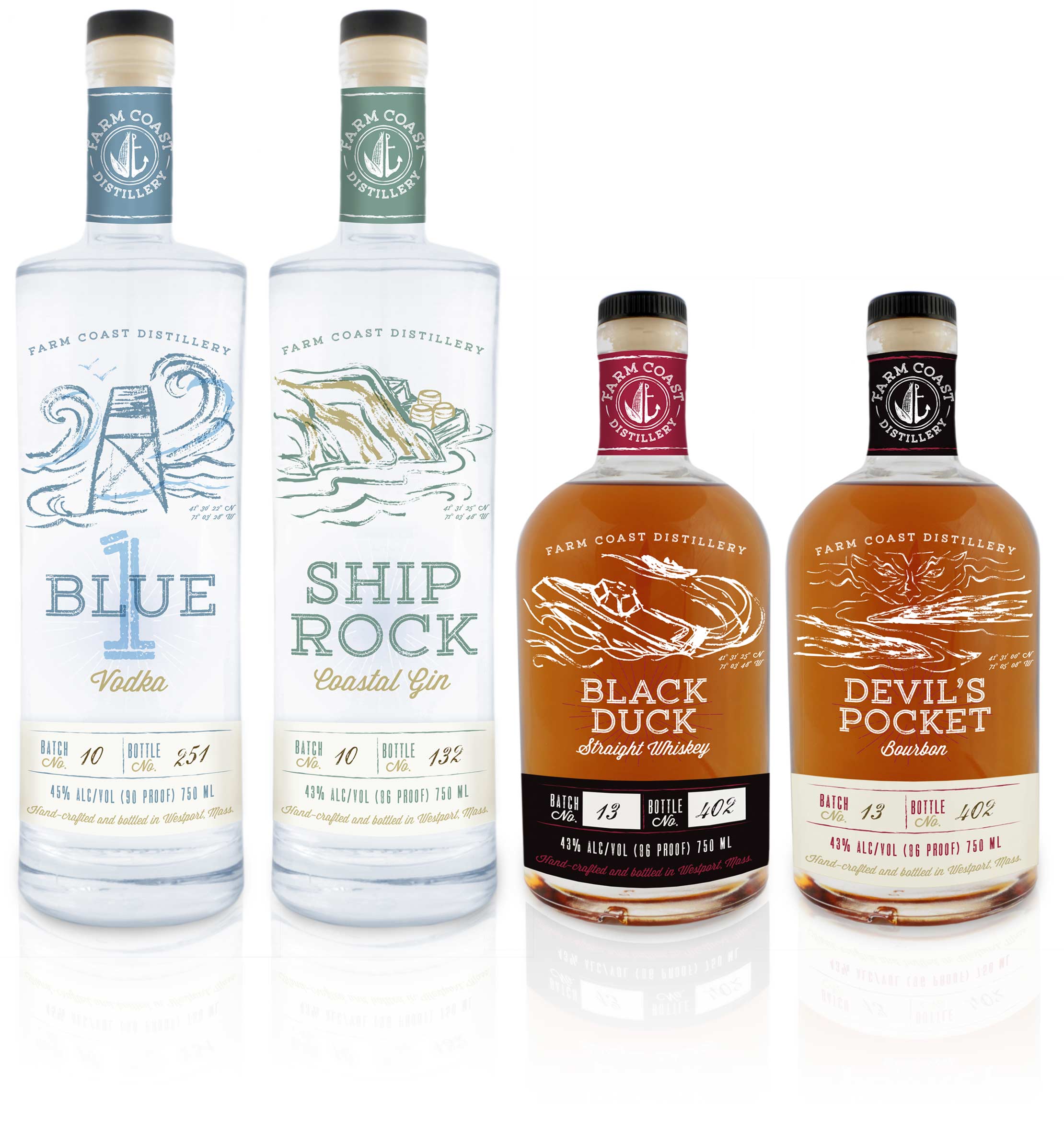
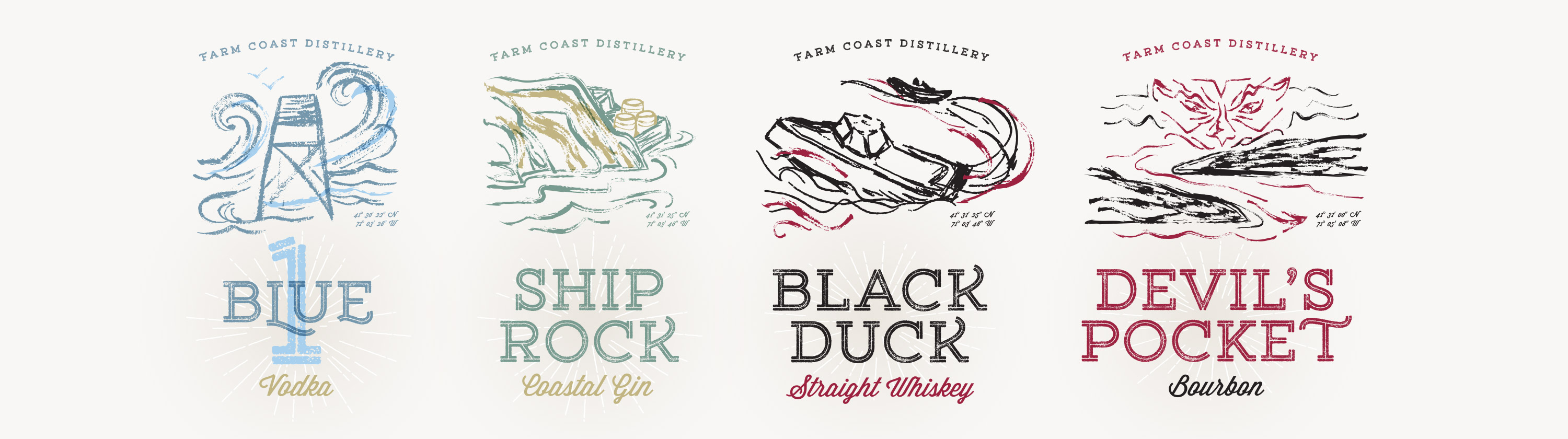
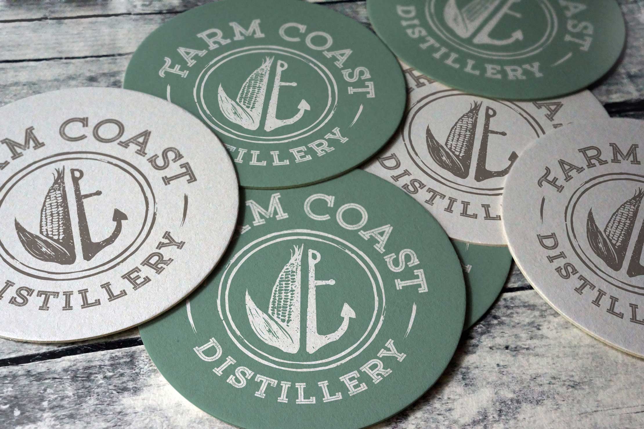
Case Study

Packaging Design for Farm Coast Distillery

Overview

Farm Coast Distillery is a craft distillery founded by Chris Parker and Brian Corey. They came to Jackrabbit in the early stages of opening the distillery, located on seventy-five acres of farmland in Westport, Massachusetts. They shared their business plan and their unique vision for the distillery with our team and they counted on us to bring that vision to life through the visual identity.

corn field

The Farm Coast Vision

The vision for Farm Coast Distillery and its historic farm location was to offer a true grain-to-glass experience for patrons. All the corn used to produce the hand-crafted bourbon and whiskey would be grown on-site at the family farm.

Branding a Destination Distillery

Farm Coast would be a destination distillery; one to host a variety of experiences throughout the year. During the summer, they would host a variety of musical guests, family movie nights, food trucks, and outdoor dining. A five-acre parcel of the farm would be utilized as a wedding venue. Another five-acre parcel would have 16 rental “eco cabins” to allow for farm stays, educational seminars, and corporate retreats. During fall and winter, they would host holiday events. The main building would house the tasting room, gift shop, and production areas.

farm coast distillery tasting room
Farm Coast logo and styles

Logo Design

The client’s vision informed our creative exploration of the first creative task: the logo design. We recommended a modern, rustic approach. The corn displayed in the logo is a nod to corn grown on the farm to produce the bourbon and whiskey. The anchor represents the coastal location of Westport, known as “Farm Coast”, where the farmland slopes gently to the beaches of Buzzard’s Bay.

Label Design

The spirits would be produced in small batches, numbered by the distiller, and hand-bottled. For this reason, it was important that the hand-crafted nature be communicated in the label design. We recommended a textured cream paper stock with blank sections to write in the batch and bottle numbers. Custom hand-painted illustrations were created, which were later digitized for high-resolution label artwork. These would be directly printed on the glassware.

Farm Coast Distillery bottle packaging design
Farm Coast Distillery branding for vodka, gin, whiskey, and bourbon

CUSTOM ILLUSTRATIONS

Each label has a distinct visual element, showcasing stories of significance to the founders and the local history of Westport. The name Blue 1 is the lifeguard code used for a major rescue and is a reference from when the founders were lifeguards together at Horseneck Beach. Ship’s Rock was the location where rum runners used to hide their boats to secretly bring rum ashore. Black Duck was a speedy rum-running boat that could outrun the coast guard. And finally, Devil’s Pocket was the name given to part of Westport Harbor where boats seemingly disappeared as they entered the mouth of the river.

Farm Coast Distillery coasters