Case Study

Brand Strategy & Visual Identity for Health New England

Redefining healthcare throughout New England.

OVERVIEW

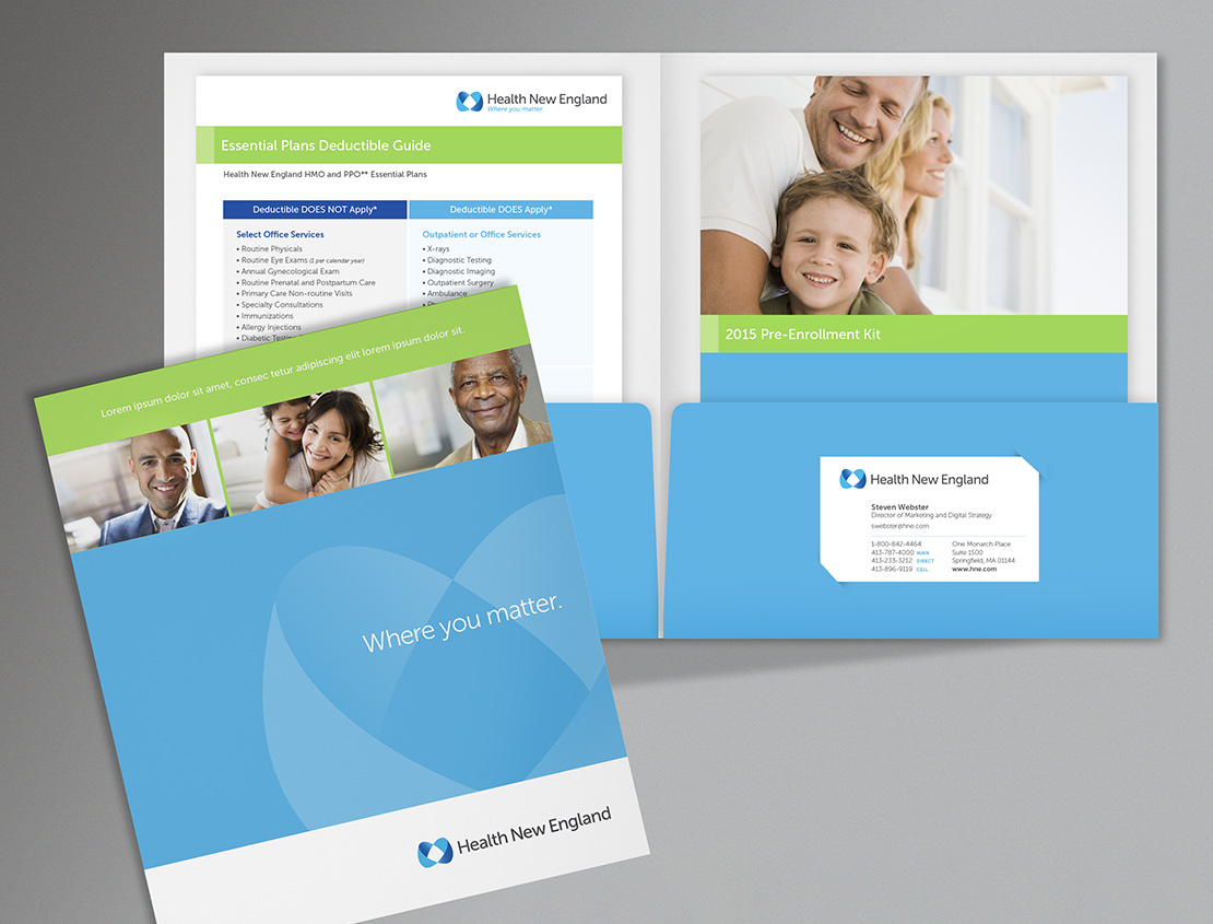
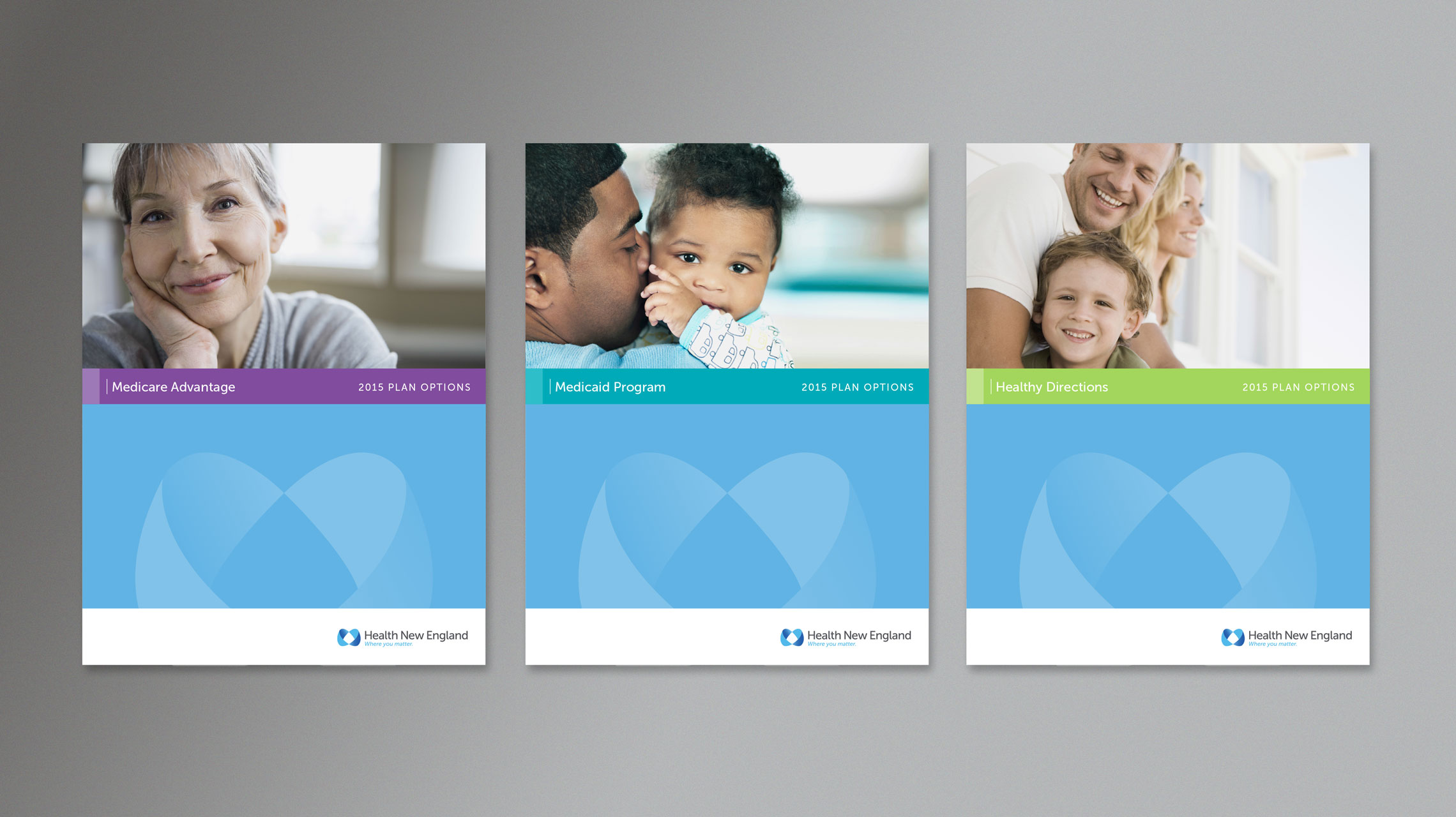
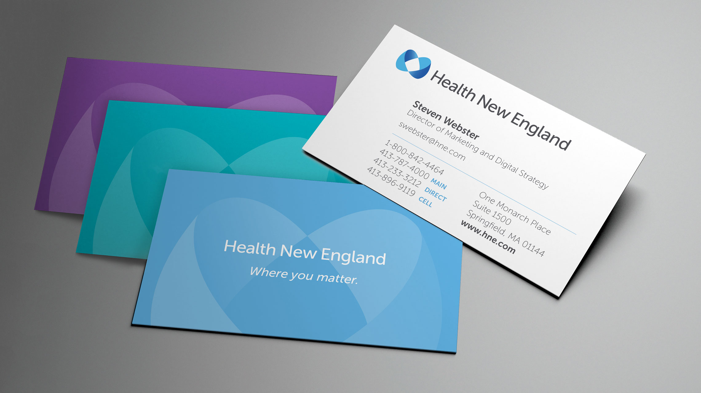
Health New England is a regional health insurer deeply rooted in compassion for people. Their brand refresh initiative started with strategy and research to establish the pillars of their guidelines, including brand personality, positioning, and principles. From there we designed a new logo with a tagline. Once the logo was complete, we were able to build out a suite of marketing template pieces.

Logo Design and Tagline Creation

After an extensive brand discovery to align the Health New England positioning, we were tasked with creating a visual representation of those items. Our focus was to represent the caring, accessible, and sophisticated feelings associated with the company. The visual elements that make up the logo include a unique symbol combined with a clean typography treatment. The two curved shapes creating the symbol touch each other, creating a cradling effect that is quite human.

Health New England logo shown letterpressed on paper
Health New England logo shown as a dimensional wall sign
Health New England logo shown on a billboard
Health New England logo design details
Health New England logo shown letterpressed on paper
Health New England logo shown as a dimensional wall sign
Health New England logo shown on a billboard
Health New England logo design details
Previous
Next

Brand Guidelines

Once the visual elements were established, it was critical to create an extensive brand guide that would educate their employees on the usage of the new graphics, color palette, typography, and photography. We also included examples of marketing pieces such as brochures, direct mailers, and advertisements so the guide would be an encompassing resource for the new brand.

Health New England brand guide cover
Health New England brand guide photography style
Health New England brand guide use of brand symbol
Health New England brand guide color palette
Health New England brand guide primary logo
Health New England brand guide brand personality
Health New England brand guide table of contents
Previous
Next

Health New England—Where you matter.

Health New England logo mocked up with older male "Where you matter"

Marketing Collateral

The newly created tagline of “Where you matter” was a critical brand element and the client wanted to ensure that each touch-point resonated with that message. Based on the marketing goals of the organization, we were able to establish design templates to ensure the brand rollout was consistent between sales, member collateral, and internal communication items.

Direct Mailers

This direct mail piece was a folded card that brokers or internal sale members could send to their focused audiences. The mailer introduces the new look and sets the overall tone of the brand.

Health New England direct mail postcard

Enrollment Kit

Health New England wanted a comprehensive kit that could be given to new members. The kit includes one-pagers of various information, customized based on the customer. Specific department contact information helps customer care calls go to the right place.

Health New England Enrollment Kit with pocket folder, one-pagers, and brochures

Brochure System

For their booklet brochure we created an expandable template that could be updated with the program name, color-coded band, and hero visual.

Health New England brochure system with covers including older woman, male with baby, male with young child

Business Cards

The business cards evoke the caring, confident, and accessible nature of Health New England employees.

Health New England business cards in blue, teal, purple