The series continues with a look at how pattern, lighting, and texture can make for better visuals!
If you didn’t catch my first “Make it Better” blog post, check it out here:
I started this series to share some techniques I find helpful when pushing myself to make my illustration or design solutions “better.” While “better” can often be hard to define and elusive, the quest itself makes for improved results.
I have a checklist of various properties and ideas that prompt me to think about a project differently. So, with this series, I’m applying these ideas to the concept of “Rabbit & Carrot.” How can I make this concept better and more interesting? What can I modify to better communicate my story or message?
Make it better with pattern, lighting, and texture!
Pattern
Pattern is a useful tool in a couple of ways. First of all, the repeating elements can just be visually pleasing in and of themselves. This is probably because the natural world around us is filled with patterns, which our minds recognize immediately to help us make sense of the world.
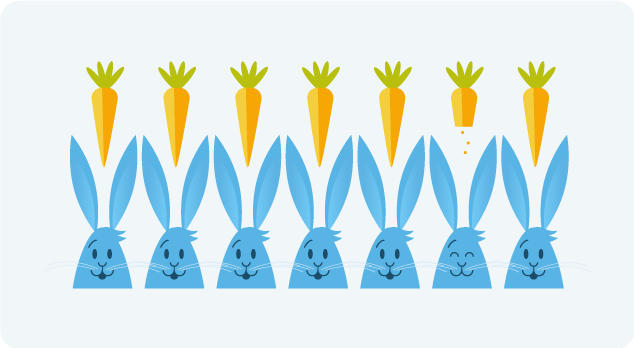
Patterns cause the viewer to assume the repeating elements will continue indefinitely. Because of this assumption of repetition, breaking a pattern can thus highlight an element and offer extra emphasis.
Lighting
Light is what visually gives form to everything. Without light, nothing visual exists! The type of lighting goes a long way in communicating a certain mood. Really high-contrast lighting can increase the intensity and drama of a scene. Spotlights very clearly highlight their subjects while faded ambient lighting unifies the subject and environment with an almost mystical and ethereal feeling.
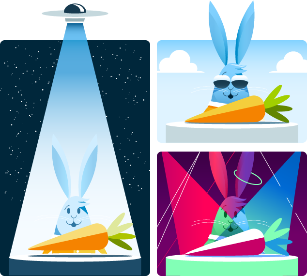
Strong shadows communicate the intensity of the light, allowing a sunny summer day to be extra bright. Different color lights easily become a party or a lively night in the city! These explorations barely scratch the surface of the power of lighting, but already they’ve given our very flat graphic much more depth.
Texture
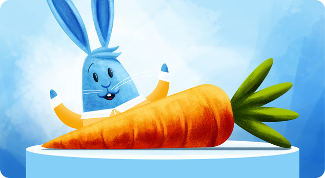
To add another level of detail and life to an image, we can introduce texture. It can make an otherwise flat image become tactile and more visually engaging. When we start to mix textures, the variety makes for a more interesting image as well. The contrasting components can play off each other, allowing our eyes to dance around and feel each unique element.
As you can see, modifying any of these properties can drastically change our image. The possibilities are truly endless!
My “Make it Better” checklist
- Size
- Color
- Shape
- Pattern
- Lighting
- Texture
- 2d? 3d? 4d?
- Medium?
- Mix mediums?
- Style
- Variety
- Similarity
- New element
- Proportions?
- Abstract? More literal?
- Inverted?
- Simpler?
- Geometry/symmetry?
- Organic/fluid
- Motion
- Foreground/background
- Layers
- Transcendant / grander
- Visceral reaction
- Sound
- Taste
- Smell
- Time – past/future
- Anticipation / relief
- Energy
- Excitement
- Connections / relationships
- Expected vs unexpected
- Yes, and…
- Next level
- Coincidences
- Universality
- What universe?
- Audience, personalities
- Different vs familiar
- Amount of
- Nature
- Look-alikes
- Mask/crop/ knock out
- Isolate it, place it
- Allude to it (just enough)
- Split it apart
- Off the page
- Combine, merge
- Depth, angles (not straight-on view)
- Mix it up
Keeping this list handy helps me focus by reminding me of specific ways I can enhance my concept. Stay tuned for part 3, where I’ll explore three more properties on my list. And hopefully, make for a better image!